Online Curbing & Concrete
Rebrand
Web Design
Development
Photography
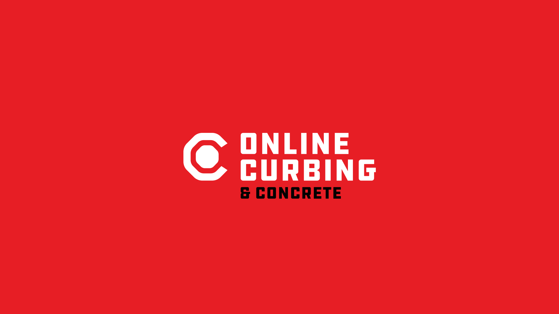
The team at Online Curbing was looking to refresh their brand in order to create new a new look that they could rally behind and increase morale. Together we developed a new modernist symbol and system that loosely resembles a cul-de-sac and the curbs that surround them while forming a capital letter C and O.
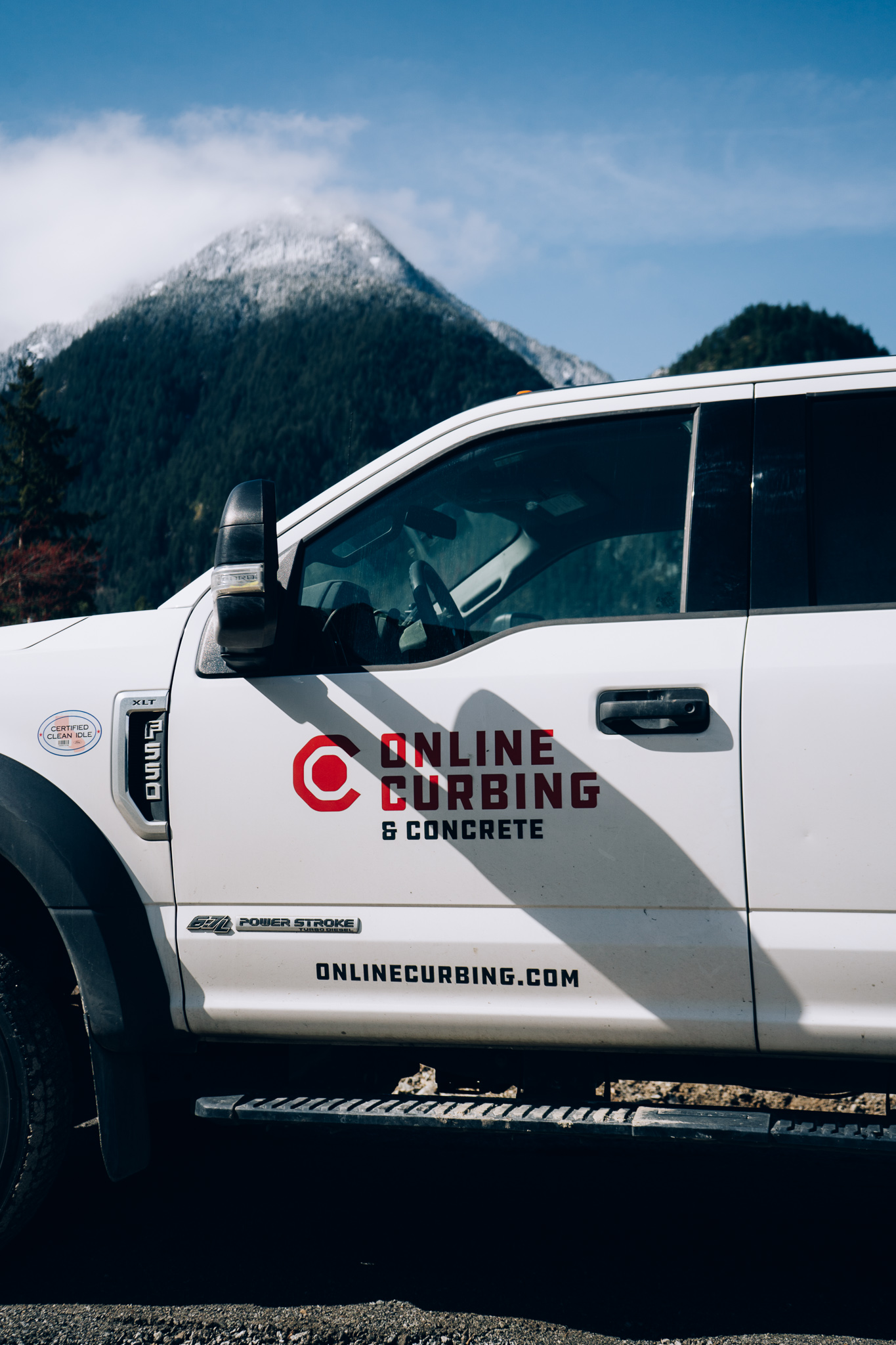
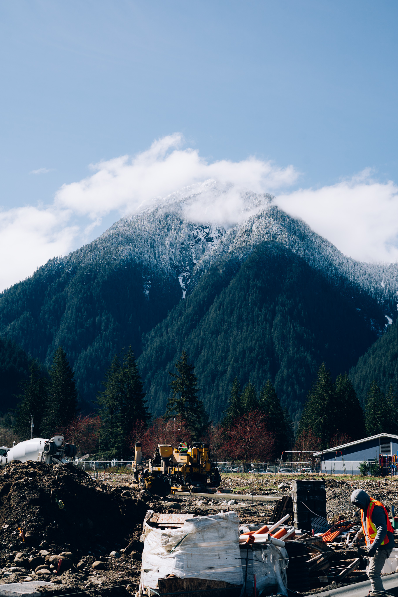
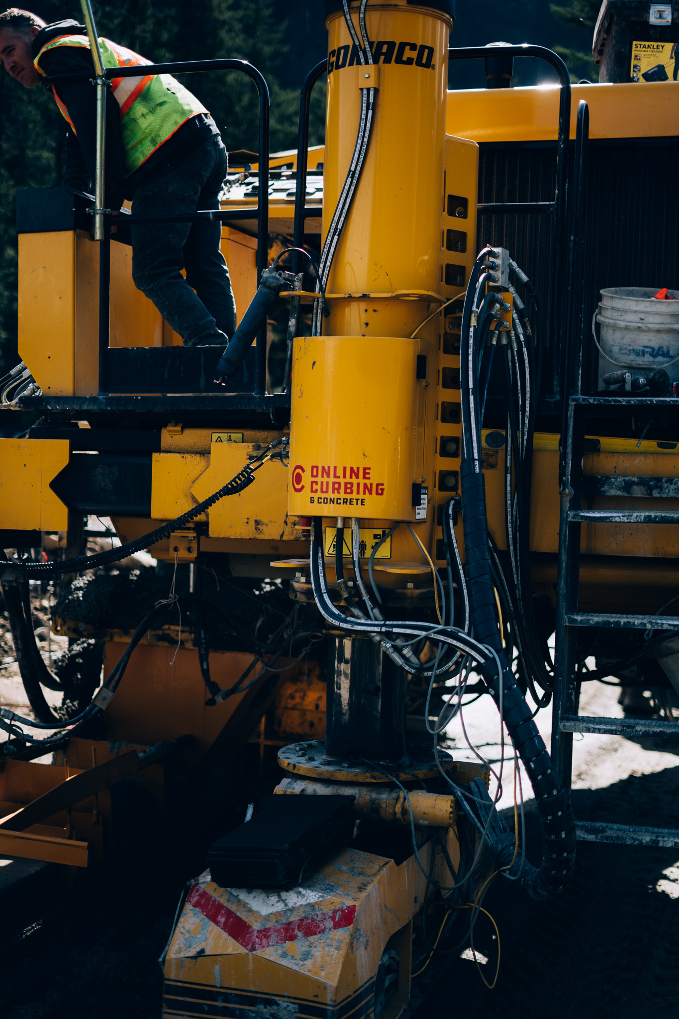
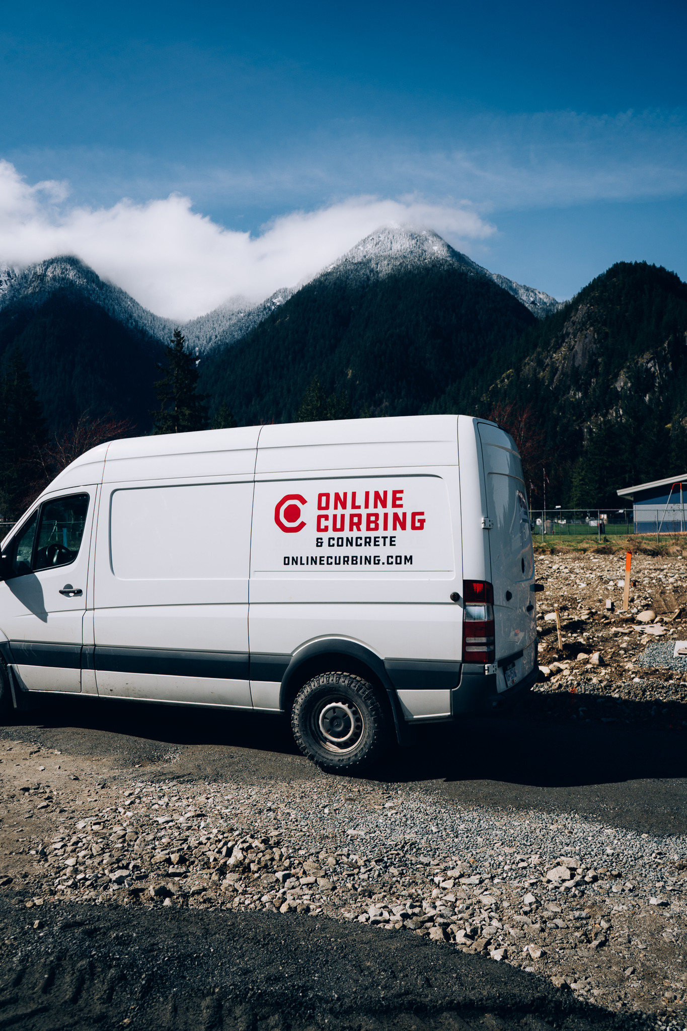
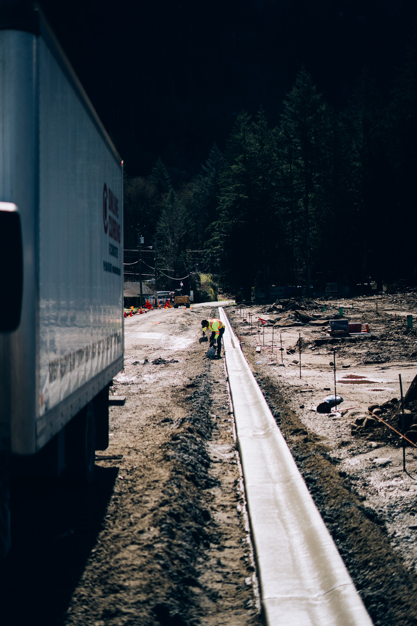
Working with the Online Curbing team I also took photos onsite for a project they were working on in Hope, BC for their new website.
Has something caught your eye?
Let's talk about what you're working on. Connect with me this week by clicking below.