Brand identity and logo design in Vancouver British Columbia
From Conrad Stel
Aug 24, 2026
Category: MARKETING INSIGHT
Your logo is not your whole brand, but it is often the first signal people remember. This page is for Vancouver businesses, founders, and growing teams that need a clear brand identity system: logo, visual direction, messaging cues, and practical assets that can move from strategy into everyday use. If you are building a new company, refreshing an existing look, or preparing to show up more consistently across digital and physical touchpoints, the goal is simple: make your brand easier to recognize, trust, and choose.
What should your Vancouver brand identity do?
A strong brand identity should help people understand who you are, what you offer, and why you feel relevant before they read every detail. For businesses in Vancouver, that might mean looking credible in a competitive local market, feeling polished enough for investors, or creating a visual system that works across your website, pitch deck, signage, packaging, social media, and sales materials. Good identity work is not decoration; it creates useful structure so every brand touchpoint feels connected.
That structure matters because people rarely make decisions from a single impression. They see your logo on a search result, your website, a proposal, an Instagram post, a storefront, a referral email, or a product label. Each moment either strengthens recognition or adds friction. Brand identity design gives those moments a shared language, so your audience does not have to re-learn who you are every time they meet you.
Strategic logo design built for recognition
Effective vancouver logo design starts with a practical truth: logos rely on familiarity to be effective. A mark does not become meaningful in isolation. It earns meaning when people see it repeatedly in the right contexts, attached to a clear offer, a consistent experience, and a memorable point of view.
That also means logos are not initially considered “great” before public exposure. They become strong as they go into the world and build association. The Nike Swoosh is a useful reminder: Phil Knight’s early reaction to the Swoosh was, “I don’t like it but maybe it will grow on me”. The lesson is not that taste does not matter. It is that a logo’s real power comes from consistency, context, and time.
A thoughtful logo should be distinctive enough to recognize, simple enough to use, and flexible enough to scale. It should not depend on a trend, a long explanation, or one perfect layout. When paired with a considered identity system, it becomes a useful anchor for the entire brand.
Brand identity design for real business touchpoints
Brand identity design should work where your business actually shows up. A logo that looks good in a presentation but fails on a mobile screen, email signature, storefront decal, app icon, embroidered uniform, or small social avatar is not doing its job. The best systems are designed with real usage in mind from the beginning.
For Vancouver companies, those touchpoints can vary widely. A hospitality brand may need signage, menus, packaging, and local street presence. A startup may need a flexible identity for pitch decks, product screens, landing pages, and investor materials. A professional services firm may need a refined system for proposals, LinkedIn content, reports, and client communications. The identity should adapt without losing its centre.
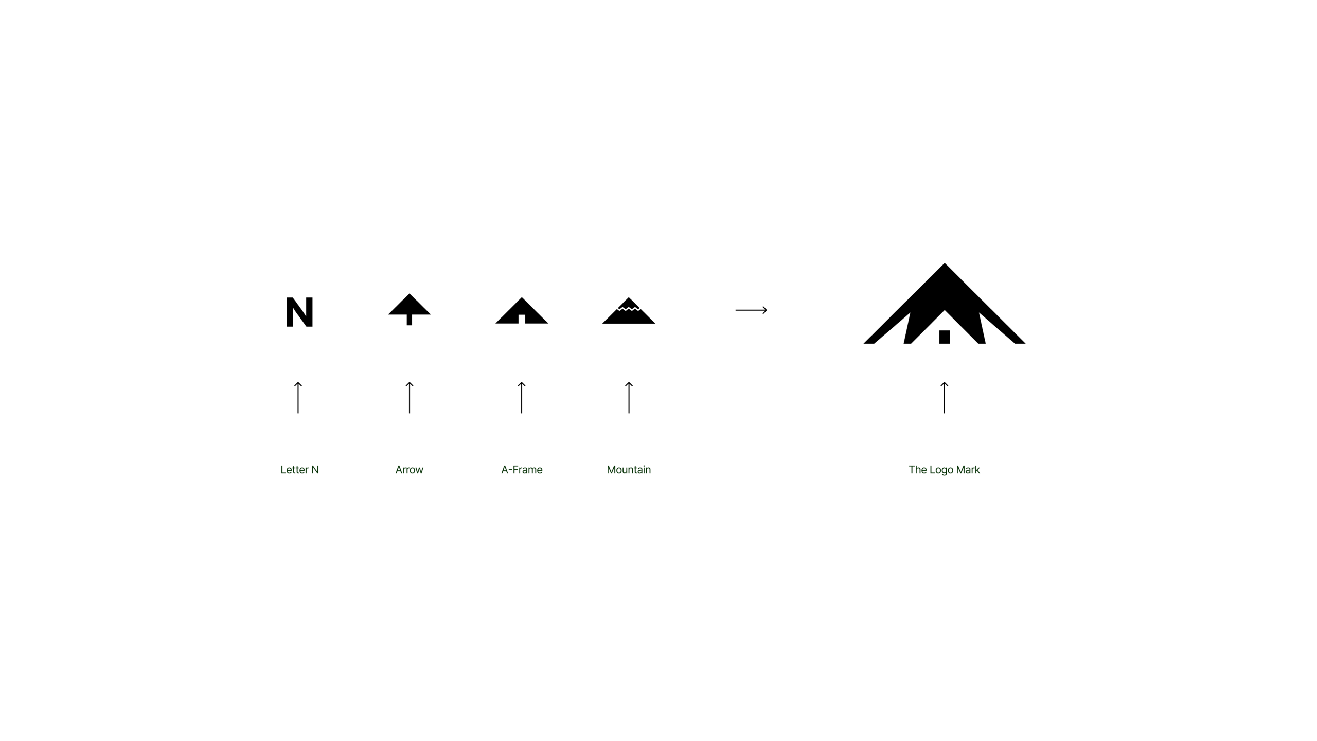
A strong visual system may include:
- A primary logo for the most common brand applications
- Secondary logo versions for tighter or alternate spaces
- A responsive mark or icon for small digital placements
- Colour palette guidance for consistency and accessibility
- Typography choices that support the desired tone
- Image, graphic, or layout direction for brand recognition
- Social, presentation, or document styling guidance
- Basic usage rules so the identity is not stretched, crowded, recoloured, or misapplied
This is where brand identity vancouver work becomes more than a logo file. The outcome should make it easier to create new materials without guessing every time.
Built for startups, local businesses, and growing teams
Brand identity for startups vancouver often needs to balance speed, clarity, and future flexibility. Early-stage companies may not have every product feature, audience segment, or sales channel fully defined yet. The brand system has to feel focused enough for launch while staying adaptable as the company learns, grows, and sharpens its positioning.
For local businesses, the challenge can be different. You may already have recognition, referrals, or a loyal customer base, but your identity no longer matches the quality of your work. A refresh can preserve what people know while making the business feel more current, professional, and consistent.
This service is a good fit if you are:
- Launching a new business and need a complete visual foundation
- Building a startup and preparing for customers, partners, or investors
- Replacing a logo that feels generic, dated, or difficult to use
- Unifying scattered visuals across your website, social media, and collateral
- Expanding into a more competitive market and need a sharper presence
- Preparing for a website redesign, product launch, campaign, or rebrand
- Creating a more professional identity without losing personality
The right approach depends on where you are now and what your brand needs to do next. A founder trying to explain a new category needs different tools than a neighbourhood business trying to become more memorable. The process should account for that rather than forcing every business into the same visual formula.
A practical process from clarity to launch
The identity process should feel organized, collaborative, and grounded in decisions that matter. Instead of jumping straight into shapes and colours, the work begins by clarifying what the brand needs to communicate. That early thinking saves time later because design choices can be judged against strategy, not personal preference alone.
A typical process can include:
- Discovery and direction We clarify the business, audience, market context, goals, tone, and practical requirements. This creates a shared foundation for the identity and helps separate what simply looks interesting from what will actually support the brand.
- Positioning and creative focus The brand’s personality, visual direction, and key associations are defined. This step helps establish whether the identity should feel precise, warm, premium, energetic, understated, local, technical, playful, editorial, or something else entirely.
- Logo exploration Logo concepts are developed around the agreed direction. The focus is on marks that can become recognizable through repeated use, not one-off visuals that only impress in a mockup.
- Identity system development The selected direction is expanded into colours, typography, layout logic, supporting graphics, and usage guidance. This is where the brand starts to become a system rather than a single asset.
- Application and refinement The identity is tested in realistic contexts such as a homepage hero, business card, social profile, presentation cover, packaging label, proposal, signage, or digital ad. Seeing the identity in use makes it easier to refine what matters.
- Delivery and next steps Final files and guidance are prepared so your team can use the identity with confidence. Depending on the project, this may support a website build, launch campaign, pitch deck, social rollout, or internal brand update.
This process gives creative work a clear path. It also helps avoid the common trap of choosing a logo only because it feels exciting on day one. The better question is whether it can become familiar, useful, and recognizable over time.
Vancouver brand identity design with local context
Vancouver is a visually sophisticated market. Businesses here often need to speak to local customers while also feeling ready for national or international audiences. A brand may need to feel connected to the city without relying on clichés, obvious skyline references, or overused nature imagery.
Good vancouver brand identity design considers the environment your audience already lives in. People compare you against polished restaurants, boutique fitness studios, real estate groups, wellness brands, SaaS startups, creative firms, and professional service providers every day. Even if those businesses are outside your category, they shape expectations for clarity and presentation.
That does not mean every brand should look minimal, premium, or restrained. Some brands need boldness. Others need warmth, approachability, or technical credibility. The point is to design with awareness: of your category, your customer’s expectations, and the places your identity will appear.
A logo is a starting point, not the whole story
Many businesses begin by asking for a logo because the logo is the most visible need. That is understandable. But the logo should sit inside a larger identity system if you want it to perform consistently.
Without a system, teams often make decisions from scratch: which font to use, which shade of blue feels right, how much space to leave, what a social post should look like, how a deck should be laid out, and whether a new campaign still feels like the same brand. Over time, those small choices create inconsistency. The brand starts to look accidental, even if the business itself is strong.
A complete identity helps prevent that by creating a practical visual toolkit. It gives your team boundaries without making the brand feel rigid. The aim is not to control every future design decision; it is to make good decisions easier.
What you can expect from the finished identity
A finished identity should be clear enough for immediate use and flexible enough for future growth. It should help you launch, promote, sell, present, or communicate without constantly rebuilding the brand from scratch. The final deliverables depend on the project scope, but the emphasis is always on usability.
Your brand identity may support:
- Website design and landing pages
- Social media profiles and post templates
- Pitch decks and investor presentations
- Business cards and stationery
- Packaging, labels, or product materials
- Signage, decals, and environmental graphics
- Sales sheets, proposals, and PDF documents
- Email signatures and internal templates
- Campaign graphics and launch assets
The practical benefit is consistency. When your brand looks and sounds connected, people have fewer reasons to hesitate. They can understand the offer faster, remember you more easily, and carry a clearer impression from one touchpoint to the next.
Design decisions guided by use, not trends
Trends can be useful references, but they should not be the foundation of a brand identity. A trend may make a logo feel current for a moment, then make it look common once too many brands follow the same pattern. The better foundation is a clear understanding of what the brand needs to signal.
That might mean choosing a wordmark because the business name is memorable and should lead. It might mean building a symbol because the brand needs a compact mark for product, app, packaging, or social use. It might mean developing a flexible visual language so the identity can support many campaigns without losing recognition.
The key is intention. Every choice should have a job, whether that job is improving legibility, creating distinction, building trust, adding energy, or making the system easier to apply. When design decisions are connected to use, the identity has a stronger chance of lasting beyond launch day.
A better way to evaluate logo concepts
Logo presentations can become subjective quickly. One person likes sharp corners. Another prefers circles. Someone wants it to feel “more premium,” while another wants it “friendlier.” Those reactions are normal, but they are not enough to choose a strong identity.
A more useful evaluation looks at how the logo behaves and what it can become. Does it remain clear at small sizes? Does it feel appropriate for the audience? Does it leave room for the brand to grow? Can it work in one colour? Is it distinct enough within the category? Does it pair well with typography, colour, and layout?
Use this checklist when reviewing a concept:
- Recognition: Can the mark become familiar through repeated use?
- Clarity: Is it readable and understandable in common applications?
- Flexibility: Does it work across digital, print, social, and physical formats?
- Appropriateness: Does it match the brand’s role, audience, and tone?
- Simplicity: Is it free of unnecessary details that will cause problems later?
- Distinctiveness: Does it avoid blending into the most obvious category clichés?
- System fit: Can it support a broader brand identity rather than sit alone?
This approach does not remove taste from the process. It gives taste a better framework. A logo still needs to feel right, but it also needs to work.
From first impression to lasting familiarity
The first time someone sees your logo, they may not feel much. That is normal. Familiarity is built through repetition, relevance, and consistent experience.
A logo on its own cannot make people care. But a logo attached to a useful product, a strong service, a thoughtful experience, and a consistent brand presence can become memorable. Over time, the mark begins to carry the meaning people associate with the business.
That is why launch is only the beginning. Once the identity goes live, it should be used steadily and confidently. The more consistently it appears across the right touchpoints, the more it can do its job.
Clear brand identity for confident launches
A strong identity gives your launch more focus. Instead of rushing to create visuals for every channel at the last minute, you have a foundation for decisions. Your website can align with your pitch deck. Your social launch can align with your sales materials. Your email announcements can feel like they came from the same brand as your landing page.
For startups, this can make the business feel more prepared. For service providers, it can make the offer feel more credible. For local businesses, it can make the experience feel more considered before a customer walks through the door.
This is especially important when the brand is new and has not yet built recognition. At launch, the identity should create enough clarity for people to understand you. Over time, consistent use helps the identity become familiar.
The right identity reduces daily friction
Brand identity is not only for customers. It also helps the people inside the business make faster, more consistent decisions. When the visual system is clear, your team does not need to debate every colour, font, layout, or logo placement.
That matters when you are moving quickly. A founder preparing a pitch, a marketer building a campaign, a designer creating a landing page, or an operations lead ordering signage all need the same brand to show up in different formats. Without guidance, the identity can drift. With a practical system, each new asset strengthens the brand instead of diluting it.
The best identity work creates momentum. It gives your team enough structure to move, enough flexibility to adapt, and enough confidence to keep showing up consistently.
Start with a focused brand identity conversation
If you are looking for brand identity vancouver support, start by clarifying what you need the identity to accomplish. Are you trying to launch, reposition, modernize, attract investors, build trust, support a new website, or create consistency across existing materials? The clearer the business goal, the better the design process can serve it.
You do not need to arrive with every answer. You may have a name and a rough idea, an old logo that no longer fits, or a growing set of materials that feel disconnected. A focused conversation can turn those scattered inputs into a practical direction.
Reach out to discuss vancouver logo design, brand identity design, or a complete visual system for your next stage. Share where your brand is now, what is changing, and where the identity needs to appear. From there, the next step is to define the right scope and build a brand system that can grow through familiarity, consistency, and real-world use.